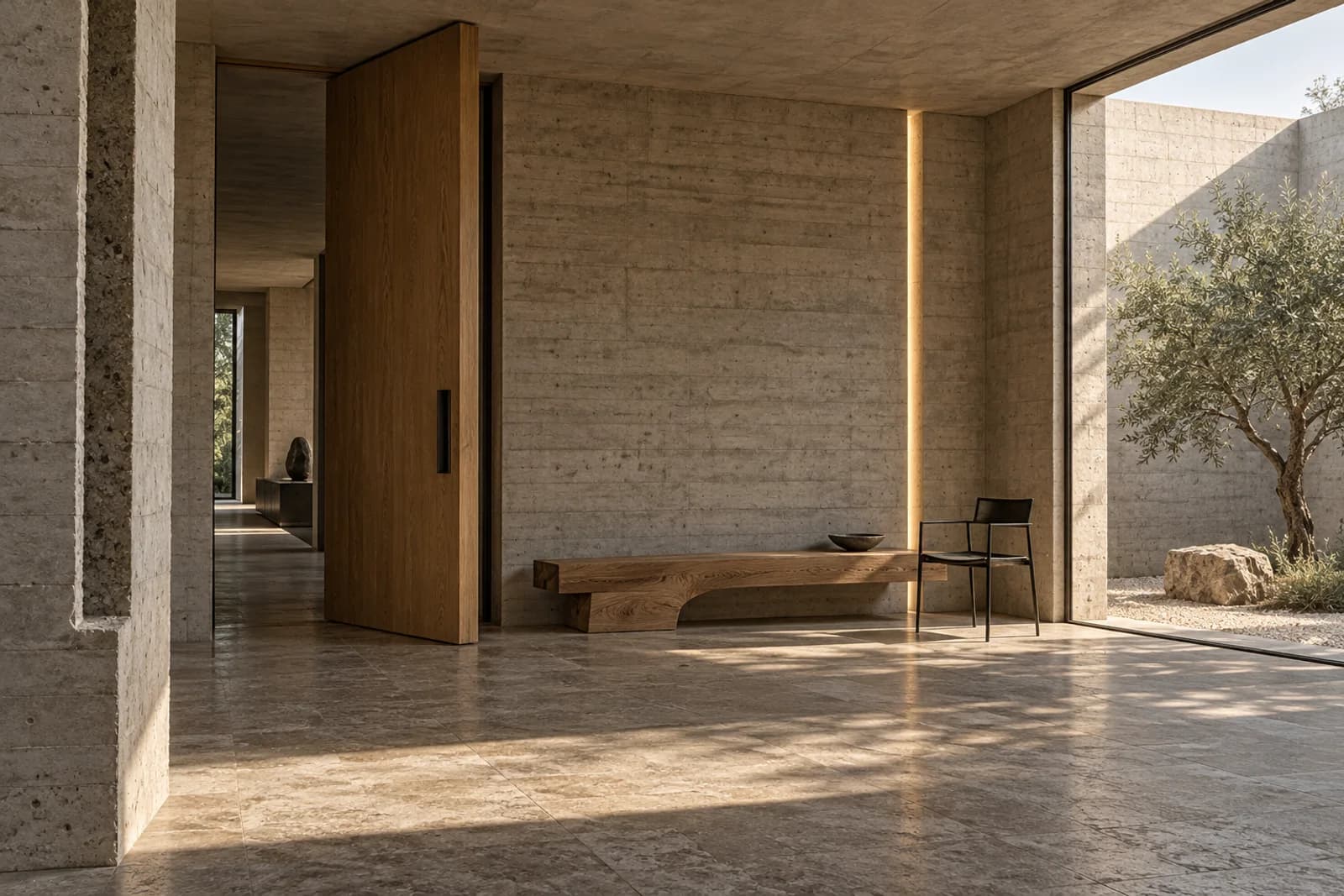
NORTH
A quieter point of view.
An independent journal concept exploring design, place and the people behind considered work.

Challenge
An editorial identity needs to carry many subjects while remaining recognisable. The task was to provide a strong reading experience without turning every story into a competing visual statement.
Strategy
Let the work and the conversation lead. A restrained hierarchy gives photographs, quotations and longer passages distinct roles, with space for the reader to move at their own pace.
Identity
Open margins, precise type and blue-grey image treatment form the journal’s visual language. A small set of rules connects covers, article openers and captions without flattening their differences.
Digital
Article pages use a predictable reading width, descriptive links and a useful route back to the index. The homepage introduces several stories without shortening them into generic promotional copy.
Motion
Transparent page edges shift as a new story arrives. Text stays stable while the surrounding composition changes, keeping the reading experience calm.
Results
This is a self-initiated concept, not a commissioned project or an operating product. The result shown is a coherent creative direction and website demonstration. No audience growth, sales or other business outcomes are claimed.
DRIFT
↗