POLAR
Pure form. A clearer source.
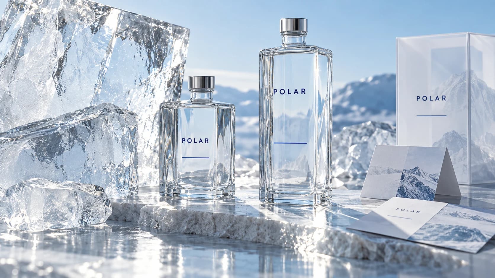
A water brand built around transparency, from the shape of the bottle to the story behind its source.
Challenge
The concept asks how a water brand can communicate care without relying on empty purity claims. Provenance needs to be understandable, and the packaging needs a recognisable point of view.
Strategy
Make the source the centre of the story. A precise visual language separates useful product information from expressive campaign imagery, giving people a clear way into the brand.
Identity
A narrow wordmark, a single blue horizon line and transparent glass establish the identity. Printed details sit at the edge of the bottle, leaving its contents visible. Packaging uses the same disciplined alignment.
Digital
The website concept connects the source, the range and practical product information. Large material photographs support a simple reading order, with labels and controls that stay clear on smaller screens.

Motion
Light crosses the glass before the name comes into focus. Frost retreats in one measured direction, and translucent sheets move apart to reveal the image beneath. The movement gives transparency a physical expression.
Results
This is a self-initiated concept, not a commissioned project or an operating product. The result shown is a coherent creative direction and website demonstration. No audience growth, sales or other business outcomes are claimed.
AETHER
↗