ORB
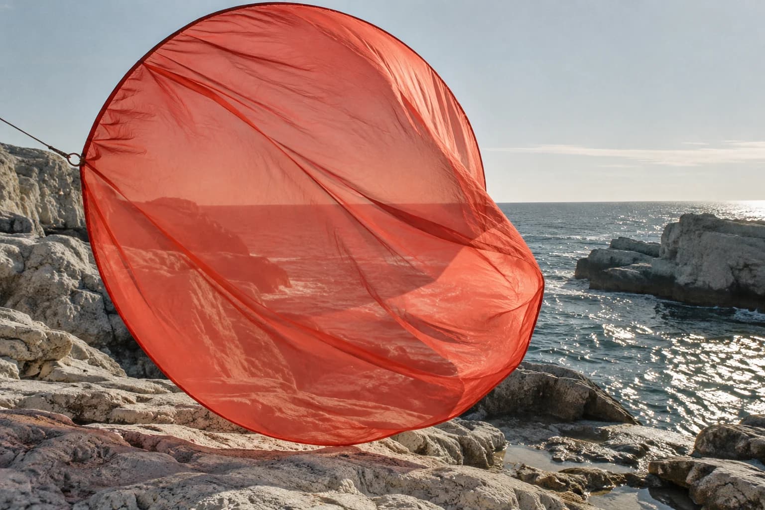
A world with its own gravitational pull.
An independent listening brand brought together by one open circle. Identity, packaging and a digital record of the sounds that connect us.
Challenge
ORB needed a recognisable identity without reducing independent music to one genre or aesthetic. The challenge was to connect a record label, listening events and an editorial platform while letting each artist keep their own voice.
Strategy
We framed ORB as a meeting point rather than a gatekeeper. The circle became an open space for artists, listeners and different ways of hearing. Every application begins with the same invitation: come closer.
Identity
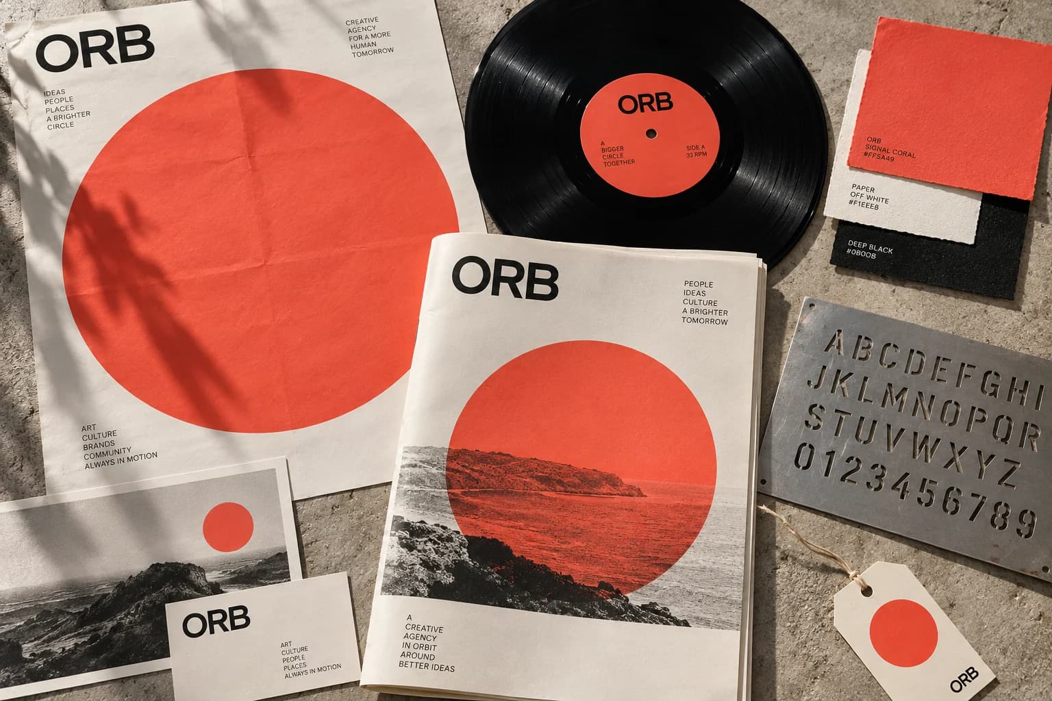
A cropped circular mark, geometric type and a coral-and-paper palette establish the identity. The system can be quiet on a sleeve or expansive across a room. Repeated rings supply a rhythm without replacing the music.
Campaign
The launch campaign moves between close-up record photography and printed circular studies. Posters behave as windows into the label rather than advertisements for a single release. Flexible credits keep the people behind each record visible.

Digital
The digital concept connects releases, artist stories and listening sessions. Circular image portals lead to useful editorial pages, while a clear hierarchy makes release information and event details easy to find.
Motion
Motion borrows the pace of a turning record: a measured rotation, a soft stop and an expanding aperture. A small library of repeatable gestures lets the identity travel across social, stage and screen.
Results & credits
This is a self-initiated concept, not a commissioned launch. The outcome shown is a coherent identity and interactive digital demonstration. No sales, audience growth or business results are claimed.
Concept, direction, design and development: Midenus. All campaign imagery and studio profiles are illustrative.
TIDE