MONO
Less noise. More meaning.
O
N
OLess noise.
More meaning.
O
N
OLess noise.
More meaning.
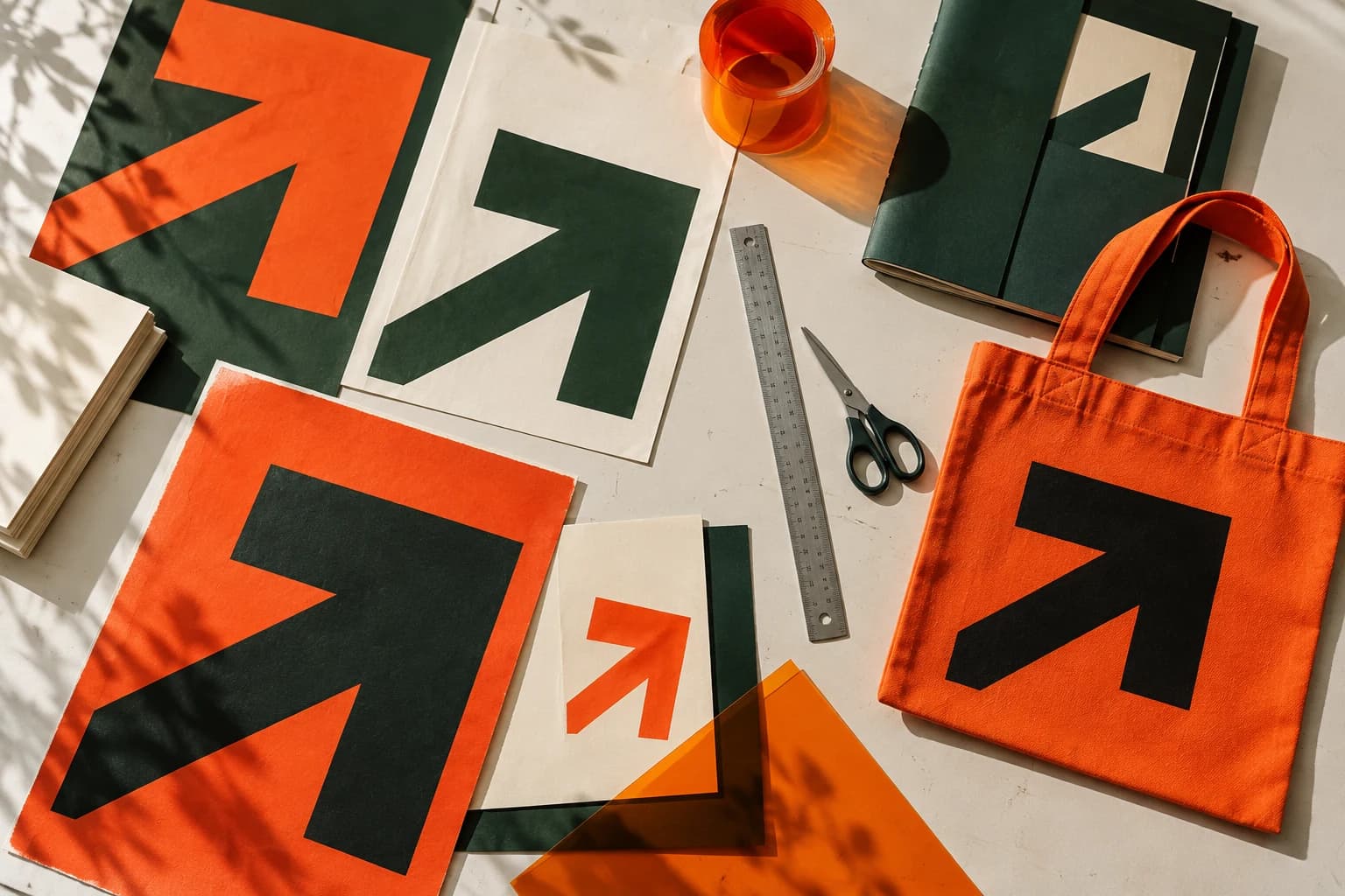
An expressive publishing identity built from a single typographic gesture. A precise framework for many different voices.
Make an independent publisher recognisable across a varied and evolving catalogue.
Strategy
Let the content lead. Give each edition a strong common structure and an unmistakable point of view.
Identity
One type family, flexible margins and a repeated linear rhythm. Restraint creates room for the work itself.
O
N
OLess noise.
More meaning.
Execution
A visual system for book covers, editorial layouts, exhibition matter and a digital catalogue.
Campaign
A line worth following. A cultural launch direction that treats each new edition as part of a larger conversation.
Digital
A browsable editorial catalogue concept prioritises reading, discovery and a confident typographic hierarchy.
A SYSTEM.
A DIRECTION.
ROOM TO MOVE.
A sample art direction system, publication studies and digital catalogue. Fictional publisher; no sales metrics are claimed.
Concept, strategy, design and digital direction: FORMA / Midenus. Illustrative imagery created for this fictional demonstration.